Explore
Featured
Recent
Articles
Topics
Login
Upload
Featured
Recent
Articles
Topics
Login
Upload
Search Results for ''
published presentations and documents on DocSlides.
1 Determining Effective Data Display with Charts
by cheryl-pisano
Chart Types Covered. 2. Column. Line. Pie. Stock....
1 Determining Effective Data Display with Charts
by celsa-spraggs
Chart Types Covered. 2. Column. Line. Pie. Stock....
Spreadsheet Contd.. Charts
by obrien
Chart is a . visual representation of data from a ...
Initial Experience with Charts in JavaFX
by mindeeli
M. Gonzalez Berges. Context . Linac. 4 BPM expert...
Visualization of Student Migration Data Using Google Charts Sankey
by natalia-silvester
Diagrams. Sean V. Hoffman. Institutional Research...
Visualization of Student Migration Data Using Google Charts
by jane-oiler
Diagrams. Sean V. Hoffman. Institutional Research...
Graphs and Charts
by conchita-marotz
Curriculum links and teaching notes. For L1-L2 Ad...
National Zone Charts Matrix
by natalie
Overview. November 13, 2018 . Including. Integrati...
Bar Charts Objectives By the end of this section, students should be able to:
by julia
represent data in a bar chart. .. Use a chart.. Ba...
Google Earth and Aeronautical Charts/CAP Grid
by tatyana-admore
2. nd. Lt. Tom Guilford. 155 Composite Squadron....
Pivot tables and charts
by mitsue-stanley
CS1100 Computer Science and its Applications. CS1...
Miranda Li Design & Data Visualization Lead
by lauren
Microsoft Consumer Data and Analytics Team. Simply...
Presenting Data IMGD 2905
by martin
Chapter 2. 2. Types of Variables. Qualitative (Cat...
Make More Sense of Your Environmental Data with
by belinda
the. Branch of Quality System’s . Blind-Sample P...
Data is your Friend
by alida-meadow
Collecting, Charting, Analyzing, and Interpreting...
Strategy Consultants toolkit
by fernando493
SELLING YOUR IDEAS WITH POWERFUL CHARTS. Introduct...
Tool Time! Tips for Viewing This Presentation
by rose
Skip to other slides in the presentation. Read alo...
Essential QI Tools Review of
by finley
QI 104: Interpreting Data: Run Charts, Control Cha...
Make Better Charts Kristin Briney
by cadie
BBE Librarian. https://xkcd.com/1798/. It’s not ...
Environmental Sensing Monitoring and Analyzing Water Temperatures
by iainnoli
Mark . Caruso, . Joseph A. Hassan, Leanne Denise ....
Charts and Graphs V105.01
by tatyana-admore
Types of Charts and Their Uses. Why create charts...
Practical Principles on
by briana-ranney
Presenting Data in Charts. Author. Help the Eye C...
More Chapter 3! (or Chapter 4)
by phoebe-click
Brave New Data. We are no longer limited to chart...
Charts and Graphs EDC&I 583
by danika-pritchard
Message Design. 8 February 2012. This Evening’s...
Which
by pasty-toler
Chart . or . Graph . is . Right . for . You. ?. B...
Graphs and Plots in R
by olivia-moreira
Graphs. . Graphs . capture . much more detail t...
The 7 Basic Tools of Quality
by test
(Ishikawa Tools of Quality). FREE Professional De...
After an
by min-jolicoeur
initial . rise . demand. . has dropped over 10%....
2012 National BDPA Technology Conference
by ellena-manuel
Creating Rich Data Visualizations using the Googl...
Module
by marina-yarberry
4. Slide deck: Presenting Data Graphically and W...
Presenting
by conchita-marotz
Data . with Excel. D.A. Whatley (SMG ‘15) – ...
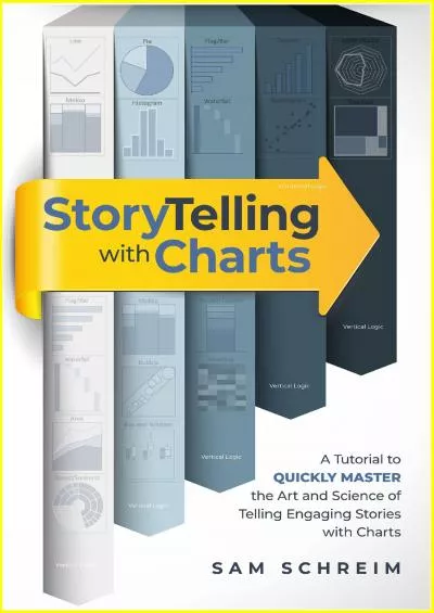
Storytelling with Charts: A Data & Text Visualization Guide for Business, Professionals and Non-Professionals: A tutorial to quickly master the art and science of telling engaging stories with charts
by quinceyzaaalan
It’s no secret that this world we live in can be...
Weighted moving average charts for detecting small shifts in process mean or trends
by calandra-battersby
The wonders of JMP. 1. Shifts in the Process Mean...
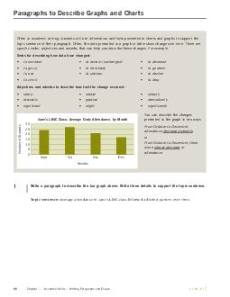
Paragraphs to Describe Graphs and Charts Often in academic writing students will use information and facts presented in charts and graphs to support the topic sentence of their paragraph
by luanne-stotts
Often the data presented in a graph or table show...
1 Graphs and Charts
by alexa-scheidler
Quantitative data can frequently be illustrated i...
1 Graphs and Charts
by min-jolicoeur
Quantitative data can frequently be illustrated i...
Lab 01:
by calandra-battersby
Bar and Line Charts. February 3, 2015. SDS 136. C...
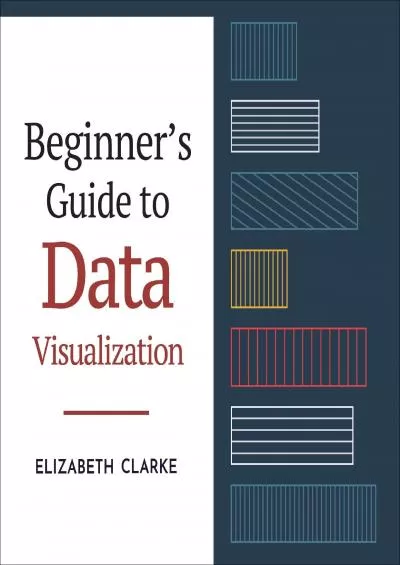
Beginners Guide to Data Visualization: How to Understand, Design, and Optimize Over 40 Different Charts (Guides for Data Analytics, Data Visualization, and Communicating Data)
by judenmasson
It’s no secret that this world we live in can be...
How to present data or results in Thesis?
by thatcher
Dr.Leeberk Raja MBBS.,MD. Consultant, Division of ...
Displaying Data Frequency
by quinn
Distributions. . . Athletic Shoe Survey. Histogr...
Load More...