
Heuristic Evaluation 3 Exercises Split class Pull out a piece of paper or something to scrawl something onto Half of the class put your head down 3 Write down the answer to this question ID: 601265
Download Presentation The PPT/PDF document "1 Quick, turn off the burner!!" is the property of its rightful owner. Permission is granted to download and print the materials on this web site for personal, non-commercial use only, and to display it on your personal computer provided you do not modify the materials and that you retain all copyright notices contained in the materials. By downloading content from our website, you accept the terms of this agreement.


Slide1
1
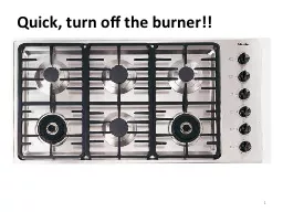
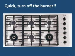
Quick, turn off the burner!!Slide2
Heuristic Evaluation 3 - ExercisesSlide3
Split class…
Pull out a piece of paper, or something to scrawl something onto.Half of the class, put your head down.3Slide4
Write down the answer to this question:
What is the name of the Canadian skip who won gold in the Women’s Curling event at the Sochi 2014 Olympics?4Slide5
Switch!!!
5Slide6
Write down the answer to this question:
What is the name of the Canadian hockey player who has won gold many times in Women’s hockey at the winter Olympics?Jennifer Jones(b) Tessa Virtue
(c) Hayley
Wickenheiser
(d) Someone else…
6Slide7
Up!
7Slide8
So…
Who’s confident of their answer?8Slide9
Recognition rather than recall
Showing people things and allowing them to select is easier than asking them to recall from scratch“Instructions” (affordances) should be easily visible/retrievable when it is appropriateSlide10Slide11Slide12Slide13
Which question is easier?
List the five phases of a user centered design cycle.
Fill in the five boxes that represent the user centered design cycle
Which labels in this list are part of the user centered design cycle? Understand, investigate, brainstorm, ideate, prototype, sketch, evaluate, test, produce.Slide14
Aesthetic and minimalist designSlide15
15Slide16
16Slide17
17Slide18
18Slide19
19Slide20
20Slide21
21Slide22
Link to cash advances doesn’t even work
Violates “aesthetic and minimalist interface”Fix: remove the link if the user can’t use itSeverity rating?Slide23
Aesthetic and minimalist design
Dialogues should not contain information which is irrelevant or rarely neededEvery extra unit of information in a dialogue competes with the relevant units of information and diminishes their relative visibility.Question: can you get away with less?Slide24
24
How does Twitter.com’s homepage guide the user’s attention?
In what ways has it used a minimalist design?Slide25
Ephemeral AdaptationSlide26
10 Help and documentation
Even though it is better if the system can be used without documentation, it may be necessary to provide help and documentation.Any such information should be easy to search, focused on the user's task, list concrete steps to be carried out, and not be too large.
26Slide27Slide28
Severity Ratings
0 – don’t think this is a usability problem1 – cosmetic problem2 – minor usability problem3 – major usability problem; important to fix4 – usability catastrophe; must fix
28Slide29
Severity Rating
Used to allocate resources to fix problemsCombination of:FrequencyImpactPersistence (one time or repeating)Should be estimated after all problems have been seenIndependently first is good
29Slide30
Monday – Guest Lecture by Nancy Lopez from Solium
Title: Usability - Caring About Humansbrief introduction about mebrief intro to Solium, Equity Plan Admin and our flagship product, Shareworks
and then get more into the UX team, and our role, responsibilities and challenges
how we go about engaging users in feedback sessions, usability testing etc.
I am hoping to include some examples of improvements made, the odd stat about successes (e.g. reduction in call volumes), hopefully some video of user testing etc. Slide31